


Facetime Logo

Not so impressed with that huge funnel on the side of Apple's new FaceTime icon. The rest of it is fine enough, nicely drawn. So I was thinking a better way would be to incorporate a more practical representation of 'audio' enabled.
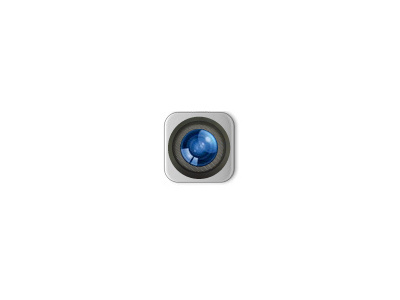
Or my Alternative alternative icon.
A speaker mesh of sorts surrounding the lens. Just seems to be a more compact design...
There are a number of ways they could have done this without adding such a monstrous appendage to the poor icon. It's as though they felt obliged to use iChat's inner bubble icon for some reason. Not necessary Apple.
The only problem is that this grey icon looks quite similar to the 'camera' icon on iOS. So looking forward to seeing other people's ideas on alternative FaceTime icons.


