Tweetbot Icon

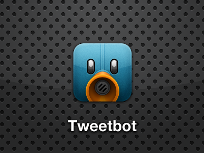
An icon for a twitter app that fits our app theme (http://tapbots.com/software/) was hard to visualize at first, but I thought it might be worth pursuing using the twitter bird I created for our website (http://drp.ly/1Kqm7l/). I like it, but have the feeling a lot of people might not. That's why we decided to release the look of the icon early and get people's thoughts on it. General response on twitter was pretty positive, but I'm sure there will be more [constructive] criticism on dribbble.
I feel like aside from minor tweaks, there's not much I can do completely different and still be part of the Tapbots branding. I've had a few people say they don't like the original bird illustration which is fine. Maybe they won't like this icon either. But I think it has character, which is probably most important to me.
Any thoughts? I know some will comment on possibly having the beak completely in view. I tried that and it didn't look right. The beak felt like it was floating. It feels a lot more balanced and grounded being cut off at the bottom.


