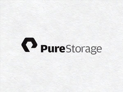
PS Logo
Final design for a new flash memory business, making Flash based hard drive arrays. The logo needed to stand out against many well known brands like Seagate, IBM, SUN, EvoStor etc.
The client conceded that the 'Pure' portion of the name posed some challenges given the prolific nature of the name in pretty much everything and anything. Pure this, Pure that, so the challenge was to not fall into something so predictable as a rain drop, or water or anything else that has been used a million times before.
But there is an element of purity you could say for flash type memory, so 'how to work with this'. This project saw the most amount of sketches and ideas I have yet done for a project, and thought I would never come up with something appropriate. Then one morning I was making some breakfast and pulled out a tub of honey, which has pure on it.
Then the bells started ringing. From this I went to bees, then to hives, then to octagon, then to speed and agility, to organisation, to intelligence, to workers to 'hive mind' and pretty much every thing to with bees could be attributed to this company.
The idea spawned some sketches on bees etc, then I focused on the hives. The octagon shape 'P' was the end result. The initial 'P' formed from a pure honey hive. Elation.
Client was ecstatic with the mark as well as having a solid meaning to it. We both got out simple, clean and bold mark as well. I have a list of over 50 direct and non direct competitors and this logo stands well on it's own as a design, which was the ultimate aim for a new start-up, to give them a fighting chance at being noticed.


