More on the Header
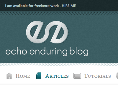
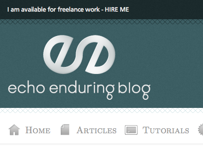
Okay, so this looks really similar, but I changed a few things. Brought the colour in the top bar down a bit, added a bit of extra detail to the cross catching, changed the shape of the g's in the logo and added a bit of hatch-shadow behind the logo itself.
I also had a hover state active in the screenshot so you can see what the menu items look like when you scroll over them.
More by Matt Ward View profile
Like


