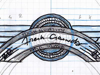
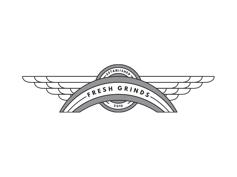
FreshGrinds rebranding - The badge with wings


Here's the next step we went through with the aborted coffee roaster branding project (if you've missed the beginning, you can follow along via the project).
The concept that really got us pumped (besides the circular badge) was the last one of the sketches. The client (and I) really liked the feel of the Wing Stop logo.
I wanted to simplify the structure and the style of the wings, one because I didn't want to reproduce their logo, and also because it felt too "hand drawn" for the project at hand.
As you'll see, finding the right arcs, width, and length for the banner proved impossible. I was trying to bring together disaprate parts, with no cohesion. I got so frustrated I actually did a doppelgänger of Wing Stop's logo, that you can see in the attachment (third before last).