Wevoke, revised

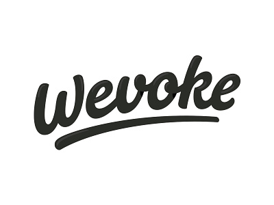
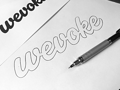
The previous "Rebound of" Wevoke logo looked too much like a font-face so I tweaked it a little to make it more unique looking. It is pretty hard to come up with an extra unique element so if you have any recommendations, please let me know.
If you look closely I have included lighting and shadow effects, was just playing around and is not part of the brand.
P.S. for the dutch people here, just published an interview: http://chake.nl/blog/een-interview-met-paul-von-excite/