Feedly Logo and Icon

In Context, although the whole site is being redesigned.
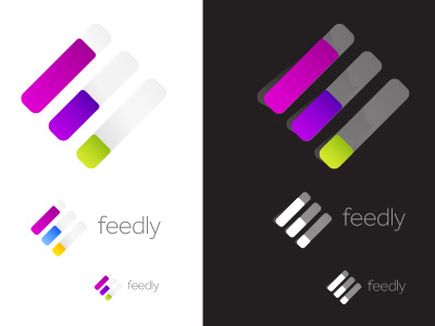
Some change in direction, but using aspect of the previous design. Mostly using the raised 'tabbed' 'F' as link to bookmarking, finding your page/way, quick easy find links to your fav news etc.
We decided to keep with the existing 'icon shape' as there is an existing loyal userbase who are familiar with the green look of Feedly. The white stripes also have a subtle link back to the '3 bar RSS' icon, although Feedly is'nt strictly all about RSS feeds, it is a important part of the experience.
The actual shape of the container is reflected at the beginning also of each of the white bars in the 'F', the bottom smallest one being the exact shame shape. So just a nice small detail to follow through with. Which also gives effect of a 'turned-up' corner.
The focus had to be creating an icon 'shape' that could be scaled down to the 16px/18px format for the browsers with out any loss of detail. This includes the colour icons for Chrome and Firefox and the mono only version for Safari. So a solid and flexible mark was aim here.
The angled version is the main app logo and variations of this will be used for the various browser icons for Safari, Firefox and Chrome.
App Icons in context (labels are existing apps)
iPhone example
iPad Example
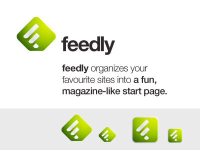
The square version designed for iPad and iPhone applications of Feedly.
Finished of with a nice slab of Helvetica Neue Bold.
Find out more on Feedly : <a href="http://feedly.com">Feedly</a>