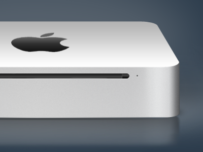
Mac mini design
Full view: http://cl.ly/1ZxM
A little project I whipped up today because I noticed there aren't a lot of Mac mini icons from after the redesign a few weeks ago. It's a tad more orthogonal than the original, but whatever.
Going for a mellow, inconspicuously classy feel. Critique welcome as always.
This post is also on Forrst, for those who aren't on Dribbble, at http://forr.st/~iBw.
Yes, still WIP.
EDIT: If you're on M*, you can find a slightly more exhaustive version of this post under Mac Critique, if you're interested.
Posted on
Jul 7, 2010
More by Carson Kahn View profile
Like


