


Less Spaghetti

Single viewport responsive web pages have been a challenge we’ve faced for a while now, and we finally landed in a place we’re proud of. We used to write so many media queries, we often joked about the potential for winning a Webby for ‘Most Media Queries’. But with so many complex queries, you run into a lot of issues — both technically and visually. It often felt like we we’re living in a mess of spaghetti code. The difficulties of crafting a site that looked how we wanted, in any possible browser size, drove us to come up with a new, more efficient solution.
This time around, we used ratios and wrote formulas to handle all of the complex logic we were trying to solve with a million different media queries. It’s not perfect, but it has certainly helped us produce better results.
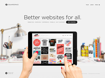
Big thanks to our front end developer Dan Johnson, the whole design team, and all the people we featured, including @Jen Mussari, who is pictured in this shot.


