


Blocky, Quirky Typeface WIP

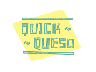
I like the letters from a logo I'm designing for a friend (the Vox Pop shot I posted recently), so I decided to expand them into a full typeface. Because of the quirkiness and inconsistency of the letterforms, each letter has an alternate to make words with repeat letters feel more organic. [These words don't mean anything, by the way; I just like the 'Q's.]


