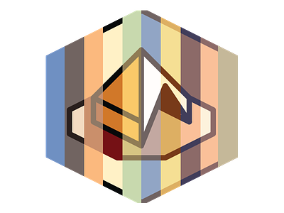
Trixel Tent - Final color palette
And the client chose the final color palette. It's a tad more muted than we thought they'd go for, but their rational makes absolute sense:
"We chose the colours because we thought blue represented water and hope in the desert. Typical desert colours can be a bit cliche that's why we were trying to create contrast here."
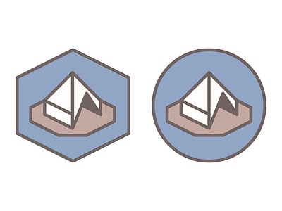
Now, I'm trying to convince them to go with the hexagon-shaped version, as it's truer to a trixel grid, but they like the circle (contrast, once again).