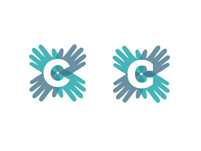
Chiropractic Hands, version 2
Here is updated progress on the chiropractic logo, still incorporating the C's of the name and healing hands, but now using one C as a radiating central mark.
Leading towards either typeface? We've narrowed it down to these two styles, and I'm having trouble choosing. Proxima Nova is more symmetrical in the shape, while Roboto is maybe a better match in style.
More by Marissa Epstein View profile
Like


