iOS 8 - Mission Control

Check out a video of the interactions in action: https://www.youtube.com/watch?v=e0U2NQ_0snA
Or grab the Xcode project and try it out yourself (don't judge the code quality though, this was done very quickly :) ):
http://cl.ly/2t3c3k011m26
Some more experimentation with UI/UX mechanics iOS could implement. iOS 7's Control Center is an interesting feature which I personally find more useful than I originally thought I would. However, I would say that as often as I use Control Center, I still use multitasking/app switching even more- it's without a doubt the single most common action I perform on my phone.
Unfortunately, I find double-clicking the home button to be irritating- there's a noticeable delay between the second click and the multitasking view appearing, and in my haste I often accidentally triple-click the home button, forcing me to wait while the OS bounces into, and back out of, multitasking. Control Center's bottom edge gesture is far faster and easier to perform, however as I said I do use Control Center frequently as well, so I wouldn't necessarily want to swap the two and use the home button double click to bring up Control Center.
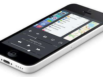
So, my proposed solution is to combine the two, as shown in these mockups. Some notes on this approach:
- As mentioned before, flicking up from the bottom of the edge allows the multitasking app views to be tied directly to the gesture, which allows for direct manipulation and avoids having to wait for a passive animation to complete before interacting with them.
- The obvious potential drawback to this combined approach is that there is less room available for Control Center- I personally find that I use a couple features of Control Center, but almost never touch at least half of them (calculator, clock, airplane mode, bluetooth). I can't be sure, but I suspect this is true for a large amount of other users as well, so my solution is to have 5 button 'slots' that can be customized with the 5 most used shortcut functions for that particular user.
- The brightness slider is also omitted for lack of space, however I think it could perhaps replace the volume slider, as I personally control my phone's volume with the hard keys 100% of the time.
Check out the video for a demonstration of how the interactions would work. I also mocked up a revised Notification Center style, with the current app 'card' being dragged down to reveal Notification Center underneath it. This feels more consistent with Control Center also being below, and provides a bit more of a 'direct manipulation' feel in my opinion as opposed to pulling a sheet down from above out of nowhere.
Check out the attached full size mockup as well as the linked video and give me your thoughts/comments/ideas/criticisms!
Credits:
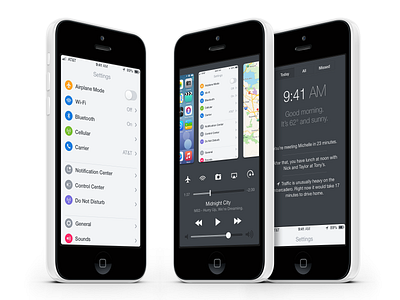
- Settings: More exploration of the visual aesthetic I'd love iOS 8 to move towards.
- Home screen by @Doney den Ouden http://dribbble.com/shots/1112280-iOS-7-Springboard-Redesign
- Notification Center concept by @Louie Mantia http://dribbble.com/shots/1236294-Lock-Screen


