Tablet UI Design 3

Hey everyone! I really appreciate all of the feedback. This is a rebound, of a rebound.
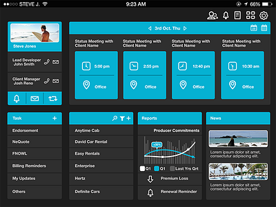
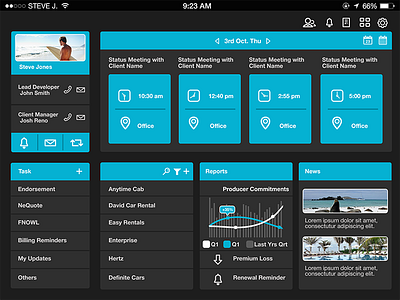
In the first step I made it so the news section looked less crowded and dropped the second sentence of the summary per news article. In this next step, I've greatly reduced the size of the top right white icons, and also expanded the spacing a bit so it too didn't look as crowded.
I've attached a zip file that contains a larger version of this design. With that said, I've also done a pink version of this design that shows the UX when an upcoming meeting is about to begin. Thanks again!
larger-view.zip
1 MB