♫ Music dribbble ♫


It's been a lifetime since I shared something with you guys for the last time. So I thought the time was right to catch up. Last year has been an amazing but incredibly busy year for me and the team at Prss. We worked our asses off to build what we think is/will be the best online publishing tool for iPad magazines with as result the launch of some great magazines(ex. Shift by TNW) via our platform in the past months. We still have a lot to do and to discover but the progress we already made with our small team is amazing. Make sure you check out our website & tool at Prss.com
---
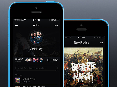
To get back on topic. Attached are the first pages(1st version, very WIP) from the redesign of the music player I designed over 2 years ago. The client wants to go mobile first with an iOS/android unified dark style. I tried to keep it really basic with some influences of both worlds(more iOS tough). Also tried to tone down the gradients, shadows and all the other layer styles as much as possible while still holding tight to my personal love for detail. Since it's still WIP it can be that some things are off or missing.
I love the Whitney font from HF&J and wanted to try it in some UI work to see how it fits. Like the outcome, but because of the complicated and expensive licenses etc I will probably have to find a lookalike for the final app. Suggestions are welcome :)


