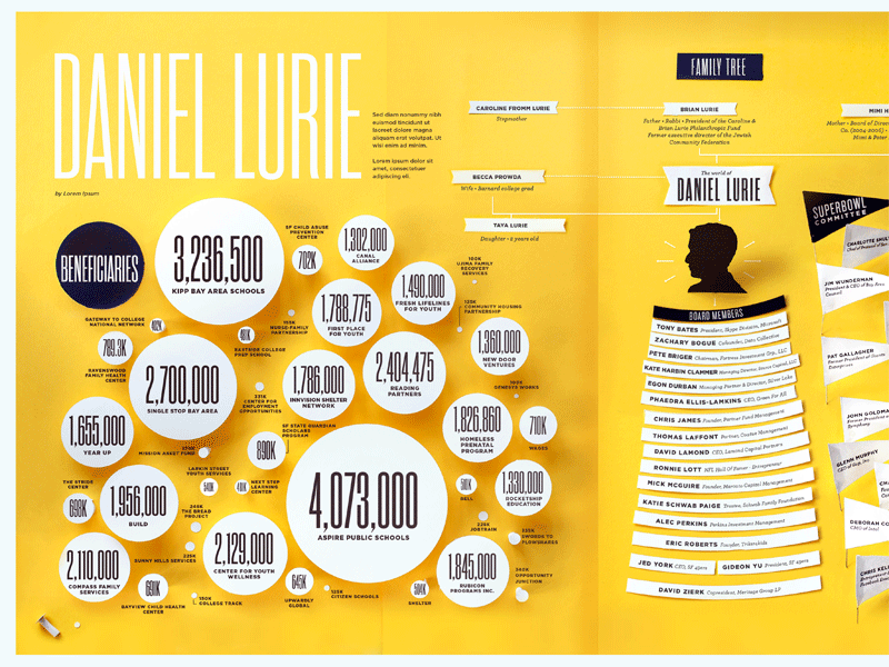
Paper infographic*


Just finished this fun thing. I made the still-life shapes first, then overlaid the text digitally, then rasterized the text and make it look like a laser printout as if were some crazy office bulletin board.
*More of an illustration, to be honest (although the circles are data-y—exactly proportional to the amount of philanthropic donations.)


