


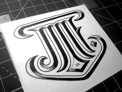
JMF
I'm going to start posting more again, feels weird that I've only posted a handful of shots in the past few months.
This was a rejected logo concept for a company whose initials are...you guessed it...JMF. I still thought it was pretty neat so I'm putting it out there for the hell of it. Check out the 2x.


