


The Writer

Usually I wouldn't post a dribbble of one of our product releases but I am particularly proud of this one. I think that it deserves a shot.
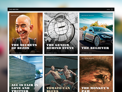
I designed The Writer with the aim of servicing writers of long content. I didn't want it to look like any other blog, so removed as much clutter as I could.
What I'm really happy about though is the typography. I used three fonts in this design: Lato, Gravitas One and Georgia and I think the combo works really well. When adjusting the type I wanted to make sure that long articles did not seem long and obviously it had to read well on a phone too.
When I uploaded some demo content, and started testing on my phone, I found myself reading all the articles by default. So the end result was exactly as intended.
If you view it on your iPad or Phone I wanted it to feel as if you had a glossy magazine in your hand. To do so we check the height of your screen and automagically resize the background image to fit. A nice solution to create that glossy/quality feel.
Hope you like it as much as I do, you can view the theme here and here.


