NEW Echo Enduring Media Logo

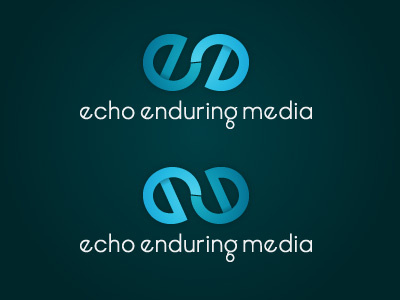
Hey guys. I've been wanting to redo my logo for a while now, and after much thinking, I had this sudden burst of inspiration today, and came up with this! The top logo is the original version, and the bottom one is obviously a mirrored alternate.
I like the first one because the first "e" is in the natural position, whereas the second one is not. However, I like the angle of the second one better, moving form top left to bottom right. Thoughts?
The typeface is a highly customized AvanteGarde. It is very similar to the type on my original logo. I just increase the tracking to help improve overall readability and then created a completely custom "g" letterform.