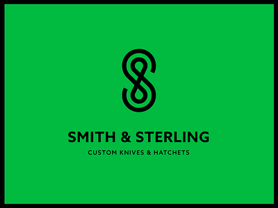
S&S Mark
Recently I made this as a logo proposal for a company who's name contain two 'S' initials and an ampersand. We completed the project with a different logo.
But I really liked this one. It has a strong feel to it. The ampersand is not even really visible, could be an '8' as well. For now I just mocked it up with a fake name.
Would love to see this as a stamp, burnt in to leather, or a gold leaf finish on a business card.
If you want you can have a look at the grid I used.
More by Jord Riekwel View profile
Like


