Dashboard Filter

Last year I worked with a small Canada based startup that lets you measure and monitor key health markers, with a simple finger prick blood test.
I helped HealthTab develop a human-centered design language that would become a solid foundation for their ecosystem of various digital products.
Quick summary
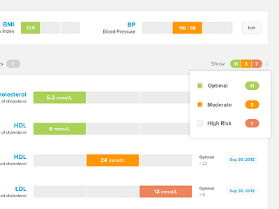
You visit a pharmacy, get a finger prick blood test, we onboard you from a point of care system [¹], meaning you sign up with couple simple steps. And, you're done there. Once your test results are ready, you get an email with a link, that shoots you to the web dashboard [²] where you sign in with the credentials you filled at the pharmacy. You log in, and Voilà, your test results! Next time you get your labs done, take a look at that report, they're horrifying, long, little text printed by early 90s printers, weird form structures, and difficult to digest layout. Obviously we wanted to simplify and drastically improve this experience. Idea was to have a simple experience where even without looking at the specific values, you can tell if results are good, moderate or bad. Color-coding the results help users easily scan their results. The final stage of the project was the product site [³] where we had to market all this hard work with an up to par public site.


