


Sketchpad Lion
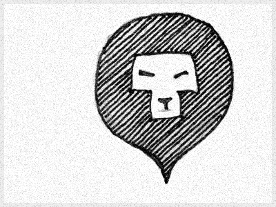
Finally feel I've found a direction for a lion logo. Working with an animal that's been iconized to death, its hard to find an original spin.
Reverse raindrop gave an iconic, modern look, yet stands out because the shape is hardly ever presented in this orientation (except Google map markers).
This is the original notebook paper pen/pencil version, quickly brought into PS. Hopefully the final will retain some of the authentic sketchiness as well as some of the character of the face.
Thoughts?


