Transit3

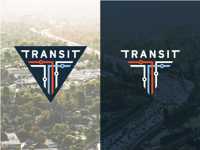
I don't normally keep posting shots but I've gotten a bunch of feedback that I've been trying out. Here I matched the line thicknesses in the type and the mark.
The goal from the beginning was to build this triangle shape with nothing but implied lines between 3 elements: type, icon, and negative space. My eye has a lot of fun with it, but it doesn't jive with some people. Love the process. Thanks ya'll.


