The Magazine Logotype [Rebound]


![The Magazine Logotype [Rebound]](https://cdn.dribbble.com/users/763/screenshots/1350545/media/d4d1fc08c6ab6cbfb27e6131109bc229.jpg?resize=400x300&vertical=center)
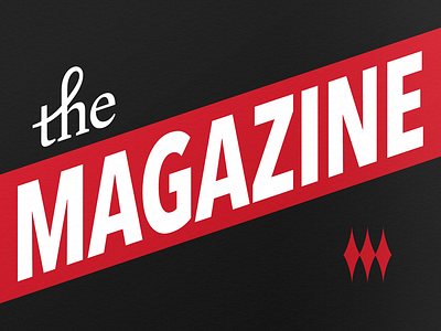
In addition to covers being updated to feature photography, The Magazine logotype also evolved to become more sophisticated and legible. Thinner type and an all-new "The" (set in Brand Pro) graced the 1st Anniversary issue of the Newsstand application.