Perspective for iOS icon

I had the pleasure of working with Pixxa on a new icon and logo for Perspective, their iPad app for audiovisual storytelling.
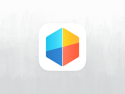
Perspective has expanded in abilities, so the brief was to make the new icon more abstract, and fit with Apple’s iOS 7 design direction. After exploring lots of ideas, we ended up keeping the cube shape, but viewed it from a different angle.
I like logos that include additional meaning and symbols, even if it’s not apparent to most viewers — we were able to fit in two Ps, and the golden colour was chosen because the shape it’s in looks a little like the yellow brick road (one of the greatest stories in film history).
I hope you like it.


