


Disqus Palette


Ah, the ol' photo of a monitor trick! I want to show a little more of the process behind Disqus.com, and the larger initiative to solidify a Disqus style guide.
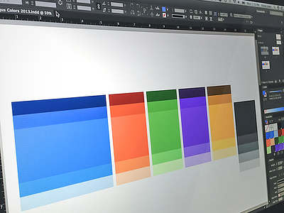
We've been working on a tweaked color palette. The team wanted to come up with something that felt more refined than previous palettes, but still afforded a sense of playfulness.
We selected 5 new colors to compliment our blue (which didn't change), and then selected various shades of each of those colors to complete a palette. Having this in place meant fewer decisions to make when designing the new site, which (hopefully!) helped us move a little faster.
If you're curious, check out the attachment for more accurate color representation.


