BVC Logo

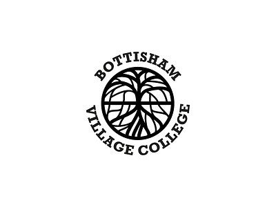
The school wanted a new logo based on a large commissioned sculpture. The sculpture is extremely intricate, so this involved a number of iterations that gradually got simpler.
I kept the asymmetrical style so as to avoid the 'just another tree logo' look. Also, it needed to replicate the sculpture fairly closely. Simplicity was needed as it was to be stitched onto uniforms.
Rockwell was already in place as the font.


