


iOS7 Icon Redesign

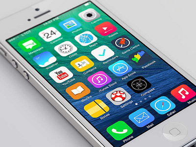


Finally found some time this weekend to put my own take of iOS7 into pixels.
Quick thoughts: It is worth saying that whatever the reaction to the icon designs for iOS7, the UX will be perfect as ever, Apple needed a big modern update, and the general public will not care.
I personally like the more minimal, flat, vibrant approach for iOS7. My issue is that a lot of the icons look very lazy to me, especially the Newsstand, Calendar, and Weather apps. For my own take I tried to maintain a similar colour palette, although less vibrant, reduced the icon corner radius and made the inner guides more central. You can see my icon template here and my colour palette right here.
Special Mentions to:
Brilliant Safari icon from Frank Rodriquez.
Game Centre icon motivated by Joseph Wachira.


