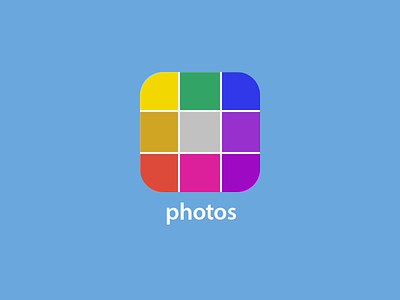
iOS 7 Photos App Icon
I don't understand the iOS 7 photo's icon.
An icon is like looking a complete world through a tiny hole.
Yes it's hard to represent an app in a tiny graphic, but if you do it right, you can tap on that icon, then your app opens, and if you feel that you got what you expected, then your experience is good, it was transparent, it was sincere, just what it needed to be.
The photos app is an abstraction of what's inside the app, not grouped colors trying to be a flower.
Your photos are grouped in a grid, that's all, nothing more, is simple.
More by Lorenzo Rojas View profile
Like


