Google's Motorola Logo Facelift

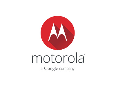
Always felt that Motorola had an awesome corporate bold logo which we loved always and I dont really like the way google have done it...
With just a few touches it can be more balanced and compact while maintaining Google's Branding and Moto's Classic Style.
Also, I have used the next design trend: Long Shadow Design. :D