Snapchat iOS 7 Redesign

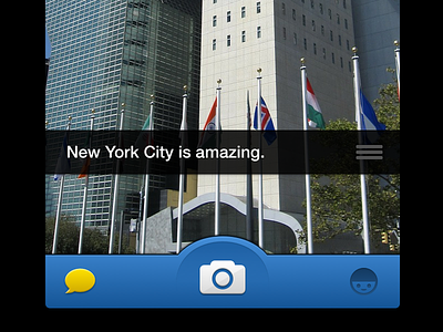
This is a concept for an iOS 7 UI overhaul for Snapchat. My goal was to put more of a focus on the Snapshot screen. I did so by shifting the different menu icons to the top of the screen, while moving the camera icons (i.e. flash & flip) to the bottom to be closer to the actual snapshot button. This frees the app to use left & right swipe to switch between various camera effects (e.g. b&w, negative, sepia, etc.), something that is currently only accessible by typing in specific keywords in the message field.
@2x is always better!
From the main camera screen (center image), you can:
- take a snapshot by pressing the hexagonal shutter button at the bottom of the screen
- turn flash on/off or flip to the front-facing camera; both these icons I shifted from the top to bring them closer to the user's thumb
- see how many unviewed snapchats you have in your inbox since the icon in the top left has an number indicator for this
- access the snapchat inbox/history page or the friends pages by tapping one of the two icons in the nav bar
I also played around with the icons indicating viewed/unviewed snapchats. A few simple rules:
- green/squares are snapchats sent to you
- red/circles are snapchats you have sent
- filled in means it hasn't been viewed yet
- empty means it has been viewed
- If someone took a screenshot then it will have a smaller circle/square within the empty circle/square
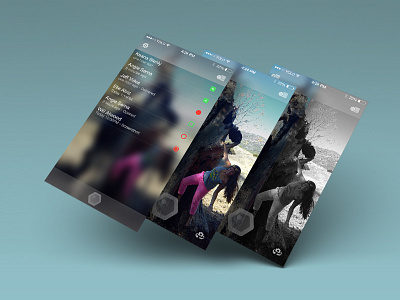
I also liked what Apple has done with the new iOS 7 FaceTime app, in that you can still see the video moving behind the glassy overlay prior to making a call. I tried to go with something similar here by having the inbox/history content (left image) overlayed on top of a glassy version of whatever is in the camera's view.
Let me know what you think!