Bullet Charts


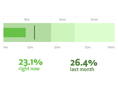
I've been experimenting with ways of communicating our success rate (vs attempt rate) of our signup form. I've always loved bullet charts — and they definitely fit the bill. I wanted to communicate our current success rate, compare against a previous value, and gauge against a known good range.
Unfortunately I found most bullet charts almost impossible to decipher without deeply investigating their origin, so I spent some time today and came up with this layout. I'm pretty happy with it thus far.


