Tikkio rebrand

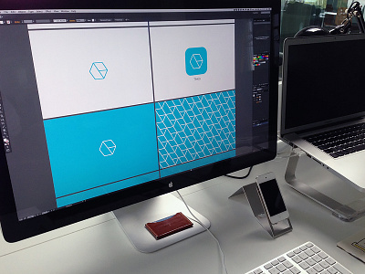

We're working on a rebrand of our event management app, Tikkio. A new logo, logomark and the whole profile is getting a fresh coat of paint. The mark symbolizes the different sides of the product; tickets, products & crew. The crossing stroke forms an abstract, lowercase «t».
Would love to get your opinion!
Real pixels in attachment.


