


Disneyland.com

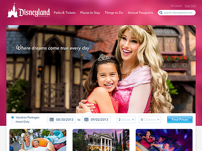


Here's a silly and fun personal project I did early this morning. The Disneyland website has beautiful photos, a quick-access vacation-booking mechanism, and a wealth of information.
But when I visit the website, I feel like each of those elements are lost because they're all cramped together. All of the content on the front page that's necessary is within the top 200 pixels.
I wanted to address three things:
1. Separate the main navigation from the "Find Prices" bar to assist with clarity. (I recognize that I removed/changed labels in the "Find Prices" bar, but I'm taking some liberties. *wink*)
2. Add a rich splash of color that complements the photo and is impactful in a similar way to how the parks and resorts are so vivid and vibrant with color.
3. Give a hint at what fun awaits you before you go too far. The front page of Disneyland.com does not try to impress you with its multitude of attractions and stunning visuals. Show me a thrill ride, a dark ride, or a family ride! Give me a hint of the kind of fun I'll be having.
As noted above, I'm taking liberties, and just as I when posted Amazon or Google unsolicited redesigns... I do not pretend to completely understand the importance of placement in regards to business needs. I only know how to make things look good, and I think this helps it look prettier, more fanciful, and more fun.
I've attached three images, which are slightly taller so you can see a bit more of the attraction grid and different "hero" images with other vibrant colors surrounding them.


