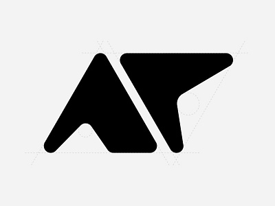
Logo Explorations

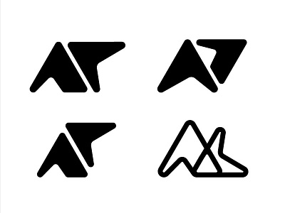
Some more logo explorations. It's supposed to loosely resemble my initials, "AC" (except for top left). Any favourites?
Read: Top left, top right, bottom left, bottom right
1. Lauren Zoucha raised a good point that the C looks more like a P but I couldn't find that pefect curve within the triangle that could make it look like a C without losing the clunky feel.
2. This composition happened randomly but I actually really like it as a mark but can't help but notice the entire thing looks like a slated P.
3. The orientation of the two letters I feel in this one turns it into more of a mark than abstract text which works nicely.
4. I really like this wireframe style. The slant between the letters makes it really appealing for me. And it actually resembles AC (Hoorah!).