Type Comparison

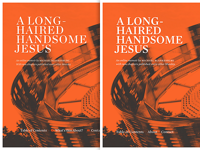

Worked on moving amemoirproject.com into Kirby this weekend. While I was under the hood I decided to make some typographic changes on the site, the most important being the switch from the Chronicle family to the Mercury family.
I was asked by a fellow Dribbbler to show a side-by-side comparison using this shot. We've since released a new chapter, so the background image is different, but you get the idea.
Be sure to view the attachment to see full-size.


