


Radosevic Honey Package

The idea of product presentation is based on bee products made to help and have preventive effect on health. As the client says "preventive treatment is a priority before the treatment," and today's buyers have a high demand for quality. We have designed a concept product presentations and showrooms OP Radosevic as a sort of natural honey pharmacy. A wide range of products for preventive health, extremely high quality royal jelly and other bee products, have the opportunity to differentiate themselves from the rest of the market as high quality products to improve immunity and health.
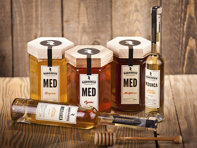
Labels are designed and adapted to the wide range of products (honey, propolis, honey liqueur-pubescent, bee powder, Royal Jelly) to maintain visibility and uniformity on the shelves. Labels have a slight retro flair and suggest products from the era of the old pharmacy production of natural medicines and traditional homemade techniques.
Honeycomb
For the extra symbolism of the product, we designed the honey packaging to be hexagonal pots. Not only will the product be differentiated from most packages on the market, but there is an interesting opportunity to stack the pots in the form of a honeycomb and it also has a link to the complete logo and visual identity. Accordingly packaging has hexagonal wooden sleeve for the lid. Wood will contribute in providing additional warmth and charm and symbolism of naturally produced products.
Watch whole project @
http://www.behance.net/gallery/Radosevic-Honey-Package/8286457


