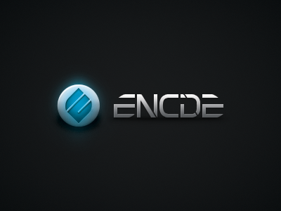
Encide's 5th Birthday & Rebrand Concept
Five years ago today, the encide community launched. Our online society has blossomed into a living and breathing network of creative professionals. After nine months of exploring concepts, mood boards, sketches, vectorized iterations, design compositions, and a billion sleepless nights, I am pleased to unveil our new visual identity and branding.
The logomark is simple, beautiful, scalable, and respectful of our origins. The novel monogram combines a capital e with a capital c. Those two letters were carefully chosen because they are the first letters in each of encide's two syllables. Furthermore, the c exists inside the e to be playful with the conspicuous homonym. The utility of the 45 degree angle is reminiscent of Jeff Nielsen's (@jeffnielsen) original logomark which conveniently disguises the monogrammatic treatment of letter forms to boast our versatile culture.
Lastly, the wordmark was custom designed to accentuate the mark while symbolizing our adoration of the technical and futuristic form that is resolute, even in the transient world of design.
We've had over 175,000 posts in over 7,000 threads with an average of 17 people online at a time every day since we started. Not bad for an invite only forum. Happy 5th birthday to everyone encide! :)
...I assure you that this milestone doesn't even scratch the surface of what is coming. Stay tuned.


