Mobile menu workflow


I've been working on this prototype for mobile menus. Here's the workflow that I came up with so far. The main features that I've been trying to hit are:
a) It's responsive
b) It handles sub navigation
c) It's intuitive
d) It takes advantage of gestures
e) It doesn't take up too much vertical space
So let me go through each step (click attachment to see all the steps):
1) This would be the default state. You would still have all the top level navigation available to you and you could swipe left and right to see them. The home icon replaces a "home" text link and is optional. But clicking the "list" icon drops down the navigation to be more mobile navigable—see 4 and 5.
2) Shadows on the left and right appear when there is content scrollable there.
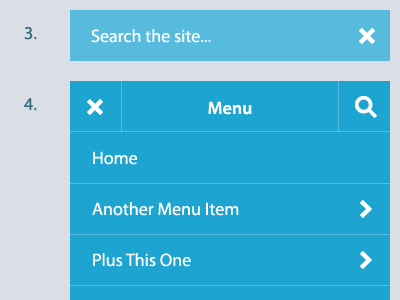
3) The search field overlays the top row of whatever state the navigation is on when clicked. Clicking the "X" cancels the search.
4) This is the root pages view. It has the menu title, the "x" which returns you to the horizontal state (see 1) and the search button. Clicking on the links takes you to the respective pages but if you click an arrow the navigation slides to the left and that pages sub navigation slides in—see 5.
5) This would be the sub navigation view. You can click on the chevron pointing left to return to the parent list. The "menu" title is now replaced with the parent list item and is clickable to go to that page. The rest is identical to step 4.
I'd love to get some input on what everyone thinks. I wasn't able to find a plugin that does this sort of thing so I'm currently working on a jQuery plugin that handles the different states along with corresponding base CSS.
Thanks!


