


Conference USA Logo

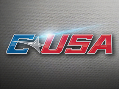
Conference USA asked me to update their logo. The task was to keep the same look as the old logo but make it look just a little bit better and easier to work with. So this is the final product with added serifs and the star streak shortened to be contained within the C (that way it doesn't make weird strokes or shadows when effects are added). The logo shown is the glossy primary that will be used for mainly video work.
Below is a link to the old logo for reference. http://blogs.orlandosentinel.com/sports_college_ucf/files/2011/01/cusa-logo.jpg


