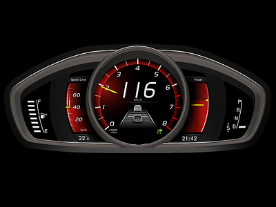
Volvo Dashboard


Hey, everyone!
At first, check out the attachment - there is much more inside. Why do I did this shot? Because, everything new to me it is a challenge and I did it for fun.
The dashboard can save your life if you can properly read it. So, first of all, is safety!
2. We are living in a digital era, so why do we need to use a usual circular speedometer/tachometer or other sensors? Yes, they are awesome (sometimes), but they are really heavy, have too many details, too much dashes/dots/remarks/etc. and it's too difficult to read them.
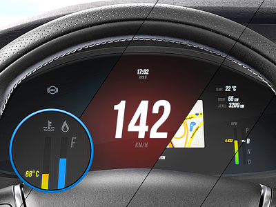
3. I'm tried to do the dashboard simple and clear as much as possible to instantly find the right point.
4. This dashboard is a single display, so some additional blocks (as navigator, weather, etc.) can be optionally configured - responsive design is a great thing :) But, of course, there is still much to do.
5. I removed everone unnecessary elements/blocks/inf. Even a steel frame - its makes too much terrible reflections/glares which are degrades perception.
6. All other pictograms/indicators are visible only when it's necessary. 'The indicator has a value when it indicates something' - Jonathan Ive, Objectified.
And yes, I changed the fuel icon - I don't like a gas station one :) Be sure you check the attachment.
P.S. Yeap, I have one mistake on the dashboard - I forget to change the transmission from 'R' to the 'D' ))
------------------------------------
Follow me on Twitter and Behance