Graphic

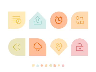
We often did a lot of size about those icons. But when the size as 16px or less, maybe do not have a good identify.
Perhaps graphic can help us. Make different graphic,and no too complex. Differently is important. Like my shot: the circle means clock. In your interface,looks nice and different. Perhaps, it is usefull:D. By the way,with the color's help,it will be better.
what do u think about this? Perhaps,this is a kick ass idea :P


