Five Guys Logo Redesign Concept

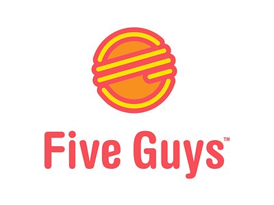
Logo redesign concept I made a long time ago for the delicious Five Guys Burgers & Fries. Their current logo is so bad that I *had* to take a stab at redesigning it.
The icon is full of symbolism. It is made out of 5 yellow lines that resemble a hamburger and also form a "G" (see what I did there? — "5 G"). Also, the burger itself has their signature double-paddy that they're so famous for.
I covered this and a whole more here.
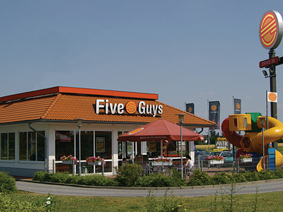
Make sure to check out the attachment for a look into what the building could look like.
I'd love to hear your thoughts about this. Do you like the redesign? Do you hate it? Do you like Five Guys?


