


Unauthorized CNN Refresh


Today CNN launched a slight refresh of their homepage and I honestly felt like it was a step backward. To me they have always had the most iconic brand of all the major networks, and their site is pretty usable compared with some of their competitors. However, the level of aesthetic polish has always been low, even by the standards of a news site.
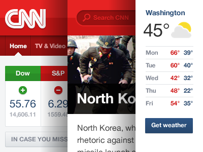
I decided to take their homepage and apply a fresh coat of paint without making serious changes to the layout (just the top part, if I had done the whole thing it would have taken me a week!). The main thing I focused on was consistency of spacing, strong alignment to a 24-column grid and neater typography. I approached this from a pretty conservative standpoint, e.g. something that I felt could conceivably be used on their live site.
I'd love to hear your feedback, and yes, I stole the weather icon from Google.


