


Settings


I imagine iOS 7 gets a bit more than a makeover, but I don't see a reason for it to get much more than this, honestly.
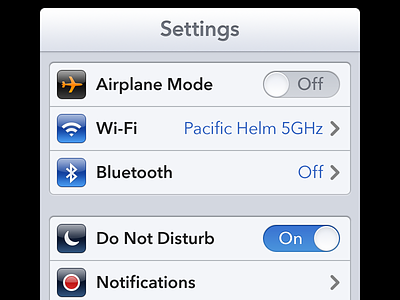
Things I've changed/updated...
Font: Avenir. Helvetica is beautiful, but can appear clunky. Avenir is friendlier and seems like a good step forward.
Navigation Bar: Light, almost like the iPad navigation bars. More rounded corners. Beveling on the "Settings" label.
Background: No pinstripes, just a clean slate gray color.
Grouped Table Views: Less rounded corners, slight beveling (like introduced lately in iOS) and minor separator-meets-the-edge fixes.
Icons: Tweaked to be consistently weighted and colored differently. Blue are radio frequencies. Navy for Notifications. Gray for audio and visual settings. Black for restrictions. There's also a tiny bit of a drop shadow on these icons.
On/Off Toggles: Less concave look, but still visually interesting and detailed. Matte instead of glossy. "Off" matches alignment with blue descriptive text.
Descriptive Text: Brighter, more vibrant blue to match both the radio icons and the "On" switch.
Chevrons: slightly longer and rounded, friendlier to match a new font.
Feel free to comment below, but please keep it constructive and friendly.


