Notes App Icon

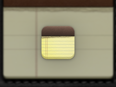
Yet another in the 'practical/subtle redesign' series (see rebound chain). The notes app icon, like many stock iOS icons, feels incredibly out of date in terms of 'graphical fidelity' (that's partly due to them coming from non-retina originals, and partly due to them just being half a decade old).
We're almost already in a 'retina-only' age, so higher fidelity textures and details are certainly more warranted now than they have been in the past.