Experimenting
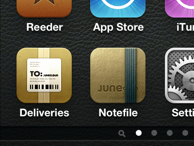
When I originally designed the Delivery Status icon, I think there was a lot more experimentation going on with iPhone icons. Some had 3D effects, some actually made theirs a different shape by giving them a black background. Don't forget the curled corners, either.
The Delivery Status iPhone icon actually started out as a truck, viewed from an angle—I thought it was fun, but it was admittedly a little weird. For version 2.0 of the app, I realized it made more sense to focus on the thing you're so anxiously awaiting—the package! The top of a box is very flat though, and it didn't make sense to have the glossy effect that many icons use to add depth. A thin bottom edge was a good way to give it some depth without standing out too much.
These days, we've mostly moved on. I never liked the unusual shapes and I was glad when Apple killed off that idea by adding wallpapers. The more extreme 3D effects seemed like they were pushing it a bit too far. We still have these bottom edges that show up occasionally though. And every time I see a new one I think about how I… don't actually like it. If there was a standard, thin bottom edge we could all agree on that might be something, but maybe we're just better off without it.
So I've decided to try experimenting with something simpler. The best iOS icons are often the simplest ones. You don't want your icon to be too flat, but emphasizing gradients or subtle highlights and shadows can go a long way. These will take some getting used to for me, but I think I actually like them more. Thoughts?


