


Benek Design New Responsive Site!

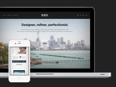

It's been too long since I overhauled my website and I've finally found the time to push out a new version. I've moved to a more elaborate case study approach (with fewer work samples) and multiple device options for displaying screenshots.
It's also responsive! Try in on your ipad or mobile phone.
Powered by ExpressionEngine.
Feedback welcome.
Follow me | Website | Behance | Pinterest | LinkedIn | Twitter


