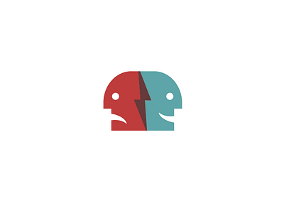
Pain Consultants Logo V2

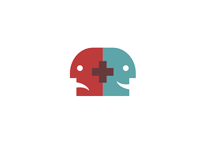
Thanks for everyones feedback on the previous shot! I found that using a medical cross as the intersecting element also worked along side with the pain bolt. This versions feels a bit more connected with the original idea of a left to right "before and after" progression with the medical cross acting as a symbol of healing. I'm interested to see what @Jens Windolf has to say since this seems to solve the previous association.
I think that we will keep both in our pocket for presenting—this seems to be the safer route to go for the medical field though.
Like it better? Like it less? Other thoughts?