


iOS 7 Data Usage App

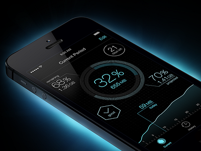

I've always wanted to do a sci-fi movie-ish interface, and I think the Compass app in iOS 7 looks kind of futuristic, so I was inspired to make this data usage app.
A few things I noticed about iOS 7:
1. The status bar items are now either black or white. I wish they bring back the grey option as it would be much less distracting in black interfaces.
2. It's difficult to emulate Dynamic Type in Photoshop. I had to use a few tricks to get an even font weight in different font sizes.
3. Textures, gradients and other effects have to be much subtler, as noted by @Max Rudberg.


